APPLE logo: history and meaning. What does a bitten apple mean at Apple?
April 1, 1976 Steve Jobs and founded Apple. Today, 41 years later, it is difficult to find a person who has not heard of her. The company that gave the world the mouse, trackpad and graphical user interface has not yet fully revealed the secret of the origin of its logo - a bitten apple.
Helped make the brand what it is today. The modern user knows what the company's logo looks like, and some even remember the rainbow-colored apple decorating the gray Macintosh. But when it comes to why Apple has a bitten apple as their logo, many are forced to admit that they do not know the correct answer to this question.
What does the apple have to do with it?
It seems that even now no one fully understands why the company was named Apple. Hardly anyone associates computers with apples. The history of the appearance of such unusual symbol brand is overgrown with myths and legends. Because Steve Jobs was working on an apple farm in the summer of 1975? Or was it all about his love for the Beatles (their recording studio was called Apple Records)? Or he just liked McIntosh apples.
Where did the history of the logo begin?
Few people know, but in 1976 Apple had a different logo. It showed Newton resting under an apple tree. Such a brand name did not look stylish at all and was not suitable for use in small sizes. If you look at the instructions for the Apple I (the company’s very first computer), you can see exactly this complex logo.

So why does Apple have a bitten apple as their logo? The answer to the question goes back to 1976, when the brand was first born. Anyone who is even slightly interested in modern technology knows that Apple was founded by Steve Jobs and Steve Wozniak. In fact, the company had three, and not two, as is commonly believed, founders - Steve Jobs, Steve Wozniak and the lesser known Ron Wayne. The latter gave up his stake in the company less than two weeks after its creation. Now Ron admits that even then he saw a successful future for the young company, but does not regret his choice. And if he had the opportunity to change his mind, he would have done the same.

The reason for refusing a 10% stake in a promising company lies in Ron's negative past experiences and his reluctance to take risks. At the very beginning of Apple's journey, it received an order for 50 computers. In order to collect them, it was necessary to take out a loan of $15,000. Wayne had heard that the customer company had a history of difficulty paying suppliers. Being no longer young (43 years old), Ron did not want to take risks by getting involved in transactions with the possibility of losing all his property. Unlike both Steves, he had own house and a car.
It was Ron Wayne who, at the beginning of the founding of the company, drew the first logo - an image of the brilliant Isaac Newton reading a book under an apple tree.

The appearance of the famous logo
The logo appeared shortly before the release of the Apple II. The history of its origin began in April 1977. Steve Jobs turned to Rob Yanov, a middle-aged designer at Regis McKenna Advertising. Back then, many people predicted failure for the company if they kept the same logo. He was too intellectual and not suitable for depicting him in small sizes. According to the author of the book "Little Kingdom": private story Apple Computer" by Michael Morritz, Steve Jobs actually believed that the logo could be one of the reasons for the poor sales of the Apple I. Curious, Rob spent several days looking at different angles apples purchased from a nearby store. As a result, the designer came to the conclusion that simplicity is the key to success, and drew a logo in the form of a monochrome bitten apple.
rainbow apple

Jobs liked the idea, but insisted that the logo be in color, despite the best efforts of an advertising executive to dissuade him due to the high printing costs. By the way, all the attacks of the company’s ill-wishers, who claim that Yanov borrowed the idea of a colored logo from the well-known rainbow flag, have no basis - the symbol of sexual minorities began to be used by the community only in 1979. However, there is an opinion that the similarity of the flags was the reason for changing the color of the logo in 1998. The bitten apple became what it was originally intended to be - monochrome.
“There was also a practical reason for the multi-colored stripes in the first logo: the Apple II was the first personal computer that could display color images on a monitor,” Yanov explained.
The most expensive logo
Steve Jobs was responsible for most work when creating a logo. The challenge was to print it in multiple colors next to each other. The four multi-stage color printing technologies known at the time left the risk that layers could be misaligned and overlap each other. Yanov suggested dividing the layers with thin black lines. This would solve the problem and make printing cheaper. However, Steve Jobs firmly decided that the logo should be without stripes. For this reason, Apple's Michael M. Scott called it "the most damn expensive logo ever created."
It is noteworthy that Rob Yanov did not receive a penny for his legendary work. “They didn’t even send postcards,” he said in an interview. Steve Jobs managed to establish great relationship with the chief marketer of Silicon Valley, and he allowed the growing company to use the services of his subordinates for free.
Bitten Apple
According to Lensmeyer, Rob Janow started with a silhouette of a black apple on a white background, but felt something was missing. A play on words Apple had previously used in advertising for the Apple I, Yanov was told to bite the apple (“bite” in English translated as “bite” and pronounced like a computer “byte”).
“The bitten apple means that the logo also no longer resembles a tomato, cherry or any other fruit,” Yanov said.
Bill Kelly, also of Regis McKenna Advertising, remembers a different story. He says that a bitten apple is a symbol of temptation and the acquisition of knowledge (a reference to the biblical tree of knowledge). A hint of how modern technologies helping humanity learn and develop faster, but at the same time making it more and more dependent on them.
inspired by Apple?
In 1954, computer scientist and brilliant mathematician Alan Turing died after biting into a cyanide-laced apple. For a long time it was assumed that it was suicide, possibly due to the chemical castration that the British government imposed on him after confessing to sexual relations with a man. Although it is now assumed that Turing's suicide was not deliberate. He was often careless with his experiments and could easily have accidentally inhaled cyanide or placed an apple in a puddle of cyanide.

Whatever happened, the bitten apple was found at Turing's bedside. Two decades later, two guys began making computers in their garage. They knew about Turing's contributions to programming and computer science and decided to honor him. And the world received an iconic logo.
According to the designer who created the logo, Rob Yanov, this beautiful story does not apply to reality. "It's just wonderful urban legend" he said in 2009. Other theories - a reference to the first woman, Eve biting the forbidden fruit, or Newton's discovery of gravity - are also wrong.
However, when actor Stephen Fry once asked his good friend Steve Jobs about whether he had famous logo attitude towards the Turing apple, Jobs responded: "God, we wish it were like that."
What does Apple's bitten apple mean?
The true reason for the birth of such an unusual brand name remains a mystery even to Apple employees. On the other hand, such an abundance of legends around this adds a special mystery to the history of the logo, allowing each user to interpret it in their own way.

According to Apple employee Jean-Louis Gasier, this is where its brilliance lies: “Our logo reflects both passion and disorder, reason and hope. We couldn't have asked for anything better." Today no one dares to deny that a memorable and simple at first glance icon played a crucial role in the development of the brand.

The evolution of the Apple logo
History of the origin and development of the company Apple interests many. Many books have been written and films have been made about this “two Steves” phenomenon, but the riddle of the logo remains unsolved.
There is an assumption that the sign depicted on the Apple logo is nothing more than a “symbol of sin”, which Adam received from the hands of Eve in garden of paradise, having learned the taste and sweetness of vice. The second, most common, says that a bitten apple is the fruit of knowledge, and every person, “biting” science, learns something new and keeps a little for himself. The third, most unexpected version origin of the logo, is at the same time the most shocking, a bitten apple is death.
The death of the man who was at the origins of the invention of the computer, who was the first to create an “automatic computing device” in 1947 and came up with the theory of artificial intelligence - Alan Turing(Alan Turing).
Dubbed the “Da Vinci of the computer world,” the genius scientist committed suicide in 1954 by biting into an apple doped with cyanide. The one-bite fruit was found on his bedside table the morning after his death.
In search of the truth, I plunged into the network and found an interview with the designer Rob Yanov(Rob Janoff), who designed the company logo, in which he shed some light on the mystery of this fact.

Rob Yanov. The designer who created the Apple logo
“I bought a whole bag of apples, put them in a bowl and painted them for a week, trying to simplify the details. Biting into the fruit was part of the experiment, and by complete accident " byte"("bite" - author's note) turned out to be a computer term, and it is not true that it symbolizes the "fruit of knowledge." I cut apples, quartered and cut out shapes, biting from different sides, but I thought the best idea was a monochrome apple with a one-sided bite on the right side.”
I would like to note that, according to Rob Yanov, for the work done, which he was ordered to advertising agency Rigs McKenna, he did not receive a single word of gratitude: “Even greeting card they didn’t send it,” complained the elderly creator of the rainbow logo.
Initially the logo was one color, but Steve Jobs I decided to decorate it with a rainbow. The bright version existed for 23 years, until 1998, until it again became the usual monochrome.
Whatever the original idea for the company symbol was Apple, we already accept all the facts of its creation as a given and another fact of history, since love for the logo is born from love for their products. And already in every bitten apple, carelessly left on the table, we notice something familiar: the Apple logo, and not vice versa. [reverttosaved]
![]()
Few people know, but the photo above is the real Apple logo.
Apple's main symbol has been updated several times already. Changing the logo is a kind of control point, marking a transition to new views and principles of the company. Moreover, these changes were never random.
Are you sure you remember the old company logos? Let's figure it out.
Newton logo (1976 - 1977)

The first Apple logo is far from the modern, laconic symbol. By and large, he stood out in those days. The logo was created by one of the founders of Apple, Ronald Wayne, who quickly sold his stake in the company. It's a cool idea - to use the widely circulated story about the discovery of gravity by Isaac Newton. But its implementation leaves much to be desired.
Minimalism? No, we haven't heard. The logo looks more like a coat of arms: a shield, a heraldic ribbon, a pompous signature. Absolutely not suitable for application to products, and all because of its bulky geometry and abundance small parts. Fortunately, it didn't last long.
Rainbow Logo (1977 - 1998)

An ambitious company needs a recognizable symbol. That is why Apple founders turned to designer Rob Janoff from Regis McKenna. It was he who created the well-known bitten apple in rainbow colors.
In an interview, the designer said that he simply bought a bag of apples and experimented with them for a week. Many hoax fans like to attribute hidden meanings this logo. But Rob Janoff debunked all the myths, according to him, he did not make any references to Alan Turing or the Garden of Eden:
- stripes of all the colors of the rainbow speak of competitive advantage Apple computers that could display color images;
- the incorrect order of these colors is justified by the fact that an apple leaf should be green;
- the fruit was “bitten” so as not to confuse the apple with other fruits;
- the consonant “byte” and “bite” remain only curious coincidences.
Monochrome logo (1998–present)

By the end of the nineties, Apple was on the verge of failure. After his return to the company, Steve Jobs made a splash - he closed unpromising projects, updated the staff and stopped renewing licenses for branded products. software. In order to forever disown the disastrous old course, the logo was also changed. From 1998 until now it has been a solid apple.
If the size of the previous logo rarely exceeded 1.5 x 1.5 cm, then the monochrome version is usually larger, brighter and more noticeable. Now the “apple” is drawn in three colors: black, white and grey. But before there were more varieties, here are the most famous:
iMac G3 logo
The release of the iMac G3 in 1998 marked the return of Apple. Stylish all-in-one PCs had just such a logo, and it was the same color as part of the case. The PowerMac, Apple Studio Display and iBook, released a year later, received similar logos.
“Aqua” logo

This logo first appeared on the PowerMac G4 Cube and was used for several years in advertising and banners. Plus, it could be seen in early versions of OS X, because the logo fit perfectly into the concept of the Aqua interface.
"Glass" logo

Users of Apple's desktop OS first saw this logo in 2002 when upgrading to OS X Panther. With the release of the iPhone in 2007, this symbol moved to mobile devices. It was replaced only in 2013 in connection with the release of iOS 7 and the abandonment of skeuomorphism.
Metal logo

Metal logos are one of Apple's favorite and recognizable features. Having appeared in the iMac G4 all-in-one PCs, such logos roamed across all categories of Apple products. iPhone cases with holes? All for the sake of the treasured metal apple.
Logo “Product.RED”

Apple is partnering with Product Red to help the latter raise funds for the Global Fund to Fight AIDS, Tuberculosis and Malaria. On the official website of the Cupertino company you can find products, part of the proceeds from which go to this fund. Once a year, on the first of December, on World AIDS Day, Apple turns its logo red.
What's next?
Of course, Apple won't change the shape of its logo. Expect exotic company color solutions It’s also not worth it, minimalism is in fashion now. Perhaps soon we will see the familiar logo made from new materials. Maybe
On the pages of our website we have already talked about the history of the creation of the store, as well as the voice assistant. Today we will talk about an equally important thing - about Apple logo, which is known throughout the world. Not everyone knows exactly how the MacBook Pro differs from the Air, but almost everyone instantly recognizes the logo in the form of a bitten apple. In this article we will talk not only about who and when it was created, but also what the company’s earlier logos looked like.
So, Apple's first logo was completely different from today. Him in 1976 created by the third co-founder of the company Ronald Wayne, who is rightfully considered one of the biggest losers of the 20th century. The fact is that he sold his 10% stake in the company 11 days after its registration. Given Apple's annual growth, Ron would now be a billionaire, worth about $40 billion.
![]()
The logo depicts an English scientist Isaac Newton, on whom the apple will soon fall. On the edges of the logo you can see the inscription: Newton... A Mind Forever Voyaging Through Strange Seas of Thought... Alone (Newton... A Mind Forever Voyaging Through Strange Seas of Thought). This is a line from William Wordsworth's autobiographical poem "The Prelude." It is worth saying that the logo turned out to be very interesting and unusual, but completely unsuitable for a technology company. So in less than a year Steve Jobs turned to graphic designer Rob Yanov, who was required to create a modern, recognizable and good-looking logo.
![]()
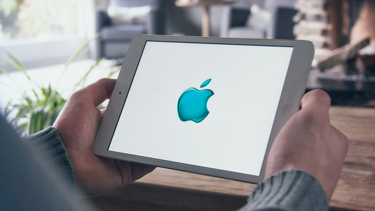
The result was a well-known bitten apple, which is Apple logo and today. However, then, in 1976, it was multi-colored. The colors were not chosen by chance: they symbolize the fact that Apple in those years was one of the few to produce computers with color monitors that could display six colors. They found their place in the logo, and the colors are arranged in a completely random order.
IN 1998 year, welcome back to Apple Steve Jobs the logo was changed to a single color black, which we can still see on our Macs. It looks concise and simple, reflecting very well the basic idea of all Apple products. However, on WWDC 2012 the company used a different, very unusually colored logo.
![]()
I must admit that it looks very nice, but it is stupid to expect that the company will change the logo again, since another option was used. Apparently, the company will delight us with new versions of the logo every year. WWDC, indirectly reflecting the direction of development for this year.
Well, as we see, the logo of the most famous company in the world has passed long haul before arriving at your final version. However, we need to thank for its creation Rob Yanov, who owns the very idea of the bitten apple, so well recognized today throughout the world.


- International accounting and reporting standards
- How to fill out a tax return correctly
- Crab salad with cheese - five best recipes
- Cutlets in foil in the oven
- Salad of crab sticks with corn, cheese and egg Crab salad with hard cheese
- Potatoes with minced meat in the oven in foil
- Cutlets in foil in the oven
- Minced meat in foil in the oven with filling
- Pearl barley porridge with beef
- Recipes for baked apples with cottage cheese, raisins, honey, nuts and cinnamon
- You can get better from potatoes
- The anniversary of the expulsion of the Karachais recalled the problem of rehabilitation of repressed peoples
- Udmurt people What peoples live on the territory of Udmurtia
- Russia is a multinational state We live in a multinational country
- The smallest peoples of the world Which group of peoples is the smallest
- How to change a cash receipt order in 1c
- Penalty calculation at the refinancing rate, penalty online
- Other current assets on the balance sheet are... Accounts and other assets
- Procedure for submitting calculations for insurance premiums Calculation of RSV for 9 months
- How to reduce VAT and maintain profits