How to type the Apple icon on any keyboard. Why is the apple bitten into the Apple logo?
Secret meanings that do not exist. Some people associate a bitten apple with original sin. According to another version, the logo was created in memory of the founder of computer science, Alan Turing, who died with a bitten apple in his hand. Despite this, the designer who developed the logo has a rational explanation for this choice.
Specialist Rob Yanov, who created the color Apple logo, told Logo Design Love why the company's 1977 logo looked the way it did.
1977 Apple logo creator Rob Janow
Logo Design Love: Is the Apple logo the best thing you've ever designed?
Rob Yanov: Yes, nothing compares to this work.
Have you ever asked Jobs why he named the company Apple?
Honestly, no. I know that for a while Steve ate only fruit. He then lived on a ranch or farm in Northern California and maintained an apple orchard (he considered apples the ideal food). He had a list of ideas for what to name the company, and he had to choose one in order to sign all the documents the next day. The name Apple was at the top of the list, and the company's creators could not come up with anything better. Jobs and Wozniak chose this name despite the threat of a lawsuit from Apple Records.

Why is the apple bitten?
Like many stories, the “legend” of the bite has been retold and changed many times. I created a silhouette of an apple, but it needed to be distinguished from other round fruits. Then I did what everyone does with an apple - I “bite” it. It's funny that 10 years after creating the logo, I started seeing stories about why the apple wasn't whole. Admittedly, many of these stories are more interesting than my logical explanation. The fact that people believe in mysterious stories, tells me that the Apple brand means more to them than just their love for the company's devices.
How did Jobs react to the presentation of the logo?
He just smiled, nodded and didn't say anything. I didn't have to describe my idea for long; we both liked it.
You said that the logo consisted of colored stripes to represent the full color of Apple monitors. How did the audience receive it?
The colorful stripes did illustrate the main difference between Apple and its competitors, but they served another function. My biggest challenge was to design a logo that would show that the computer was friendly enough to be brought home and used by the family. While (in 1977 - editor's note) computers evoked rather negative associations. I wanted to create a positive connection with Apple devices.
 Apple II computer released in 1977
How do you think the logo contributed to the company's success?
The company's success lay in the fact that Steve Jobs knew well what people needed from technology even before they knew about it. He developed very high quality standards and product designs were also great importance. So I don't think the logo played a big role in the company's success. People love the Apple brand name because they like the technology of this manufacturer. If they didn’t like the brand name, they wouldn’t put it on the rear window of the car.
On the pages of our website we have already talked about the history of the creation of the store, as well as the voice assistant. Today we will talk about an equally important thing - about Apple logo , which is known throughout the world. Not everyone knows exactly how the MacBook Pro differs from the Air, but almost everyone instantly recognizes the logo in the form of a bitten apple. In this article we will talk not only about who and when it was created, but also what the company’s earlier logos looked like.
So, Apple's first logo was completely different from today. Him in 1976 created by the third co-founder of the company Ronald Wayne, who is rightfully considered one of the biggest losers of the 20th century. The fact is that he sold his 10% stake in the company 11 days after its registration. Given Apple's annual growth, Ron would now be a billionaire, worth about $40 billion.
![]()
The logo depicts an English scientist Isaac Newton, on whom the apple will soon fall. On the edges of the logo you can see the inscription: Newton... A Mind Forever Voyaging Through Strange Seas of Thought... Alone (Newton... A Mind Forever Voyaging Through Strange Seas of Thought). This is a line from William Wordsworth's autobiographical poem "The Prelude." It is worth saying that the logo turned out to be very interesting and unusual, but completely unsuitable for a technology company. So in less than a year Steve Jobs turned to graphic designer Rob Yanov, who was required to create a modern, recognizable and good-looking logo.
![]()
The result was a well-known bitten apple, which is still the Apple logo today. However, then, in 1976, it was multi-colored. The colors were not chosen by chance: they symbolize the fact that Apple in those years was one of the few to produce computers with color monitors that could display six colors. They found their place in the logo, and the colors are arranged in a completely random order.
IN 1998 year, welcome back to Apple Steve Jobs the logo was changed to a single color black, which we can still see on our Macs. It looks concise and simple, reflecting very well the basic idea of all Apple products. However, on WWDC 2012 the company used a different, very unusually colored logo.
![]()
I must admit that it looks very nice, but it is stupid to expect that the company will change the logo again, since another option was used. Apparently, the company will delight us with new versions of the logo every year. WWDC, indirectly reflecting the direction of development for this year.
Well, as we see, the logo of the most famous company in the world has passed long haul before arriving at your final version. However, we need to thank for its creation Rob Yanov, who owns the very idea of the bitten apple, so well recognized today throughout the world.
The first Apple logo was created by Ron Wayne. This name says little not only to ordinary people, but even to geeks. Meanwhile, Ronald is the third co-founder of Apple, and also the biggest loser of the 20th century. He sold his 10 percent stake in the company for $800 just 11 days after registration. If he had not taken this rash step, Ronald would now be one of the wealthiest people in the world with a fortune of $30 billion. Analysts say Apple's value will triple in three years, which means Wayne may have lost about $100 billion simply by not believing in Apple.
The logo created by Ronald Wayne has nothing in common with the current one. It was a miniature work of art. In the center was the outstanding English scientist Isaac Newton, on whom an apple was about to fall (insight!). In the future, the “Newton theme” will be continued when Apple releases its PDA.
If you enlarge the logo, you will notice that along the border there is the text: Newton... A Mind Forever Voyaging Through Strange Seas of Thought... Alone (Newton... A Mind that sails alone through strange seas of thought). This is a line from William Wordsworth's autobiographical poem "The Prelude", which in its entirety goes like this:
And from my pillow, looking forth by light
Of moon or favoring stars, I could behold
The antechapel where the statue stood
Of Newton with his prism and silent face,
The marble index of a mind for ever
Voyaging through strange seas of Thought, alone.
Translated it looks like this:
From my pillow, illuminated by the light
I could see the moon and good stars
On the pedestal is a statue of Newton.
He is holding a prism. Quiet face
Like the dial of a mind that's alone
Sailing through strange seas of Thought.
 The logo turned out to be interesting (all these references to Newton, who really was lonely, a touch of mystery, etc.), but not very suitable for the realities of modern business. Therefore, Wayne's work was used for about a year. Steve Jobs then turned to graphic designer Rob Janoff for help. It was necessary to create a simple, modern-looking, well-recognizable logo.
Rob completed this task in about a week. In an interview with the Revert to Saved blog, Yanov talked about how the logo was created. Rob bought apples, put them in a bowl and began to draw, gradually removing unnecessary details. The famous “bite” was made on purpose: the logo had to be drawn so that it would be strongly associated with apples, and not other fruits/vegetables/berries. The similarity of the pronunciation byte/bite (byte/bite) also played into its favor.
![]()
Rob Yanov made the logo in color, which provided good ground for speculation and myths. The most common one, actively supported by Win and Linux users, comes down to the fact that the Apple symbol reflects support for sexual minorities. This is not entirely true. Apple truly supports the LGBT community, as evidenced by recent video, however, the color logo was created a year before gays began using the rainbow as a symbol.
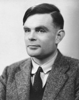 The second myth is even more interesting. They say that an apple painted in the colors of the rainbow is a kind of sign of respect to Alan Turing. Turing is an outstanding English mathematician and cryptographer who made a significant contribution to the fight against fascism. During World War II, he cracked the Kriegsmarine and Enigma ciphers, and after that he had a huge influence on computer science (Turing test, work on the theory of artificial intelligence). Turing's merits did not save him from prosecution for homosexuality. Alan faced two years in prison if he did not agree to hormone therapy (which, among other things, led to breast growth and chemical castration). In addition, Turing was deprived of his most valuable asset: the opportunity to do what he loved - cryptography. As a result, Alan became a recluse, and then completely committed suicide. Moreover, the form of suicide was very unusual: Turing bit off an apple, which he had previously pumped with cyanide.
Rob Yanov refutes both myths. According to him, there is no need to look secret meaning. Apple's color logo was intended to reflect the fact that the company produces computers with color monitors. The Mac display at that time could display six colors. These colors were precisely indicated on the logo. There is also no pattern in the arrangement of colors. Yanov placed the colors in random order, only green color was placed first intentionally.
The logo existed in this form for 22 years. In 1998, Steve Jobs, who had previously been ousted from Apple, returned to the company. Apple was experiencing huge financial problems at the time. Competitors sarcastically advised to close the shop and distribute the money to shareholders. Drastic measures were needed. And do you know what pulled Apple out of the crisis? Industrial designer Jonathan Ive has come up with a new case for the iMac G3.

![]() Computers that look like candy canes literally saved Apple. Moreover, they became iconic - their images appeared in films, TV series, and glossy magazines. It is clear that a colorful logo on a colored poppy would look stupid. Apple has moved away from using a color logo. So, since 1998, we have seen a laconic monochrome logo. The company has matured. And with her, so do we.
Computers that look like candy canes literally saved Apple. Moreover, they became iconic - their images appeared in films, TV series, and glossy magazines. It is clear that a colorful logo on a colored poppy would look stupid. Apple has moved away from using a color logo. So, since 1998, we have seen a laconic monochrome logo. The company has matured. And with her, so do we.
Rob Janow created an outstanding logo. This is not a banal insignia, but a real Symbol. But Yanov’s achievements were not particularly noted by Apple. At the beginning of the note I mentioned Nike logo. It was created by Carolyn Davidson, a student and freelancer from Oregon. Nike, a young company at the time, paid $35 for the work. But ten years later, the company’s founder, Phillip Knight, presented her with an expensive ring with a diamond “stroke” - the signature style, as well as an envelope with company shares. Knight appreciated the designer's work, making her a co-owner of Nike (albeit with a small stake).
Few people know, but the photo above is the real Apple logo.
Apple's main symbol has been updated several times already. Changing the logo is a kind of control point, marking a transition to new views and principles of the company. Moreover, these changes were never random.
Are you sure you remember the old company logos? Let's figure it out.
Newton logo (1976 - 1977)

The first Apple logo is far from the modern, laconic symbol. By and large, he stood out in those days. The logo was created by one of the founders of Apple, Ronald Wayne, who quickly sold his stake in the company. It's a cool idea - to use the widely circulated story about the discovery of gravity by Isaac Newton. But its implementation leaves much to be desired.
Minimalism? No, we haven't heard. The logo looks more like a coat of arms: a shield, a heraldic ribbon, a pompous signature. Absolutely not suitable for application to products, and all because of its bulky geometry and abundance small parts. Fortunately, it didn't last long.
Rainbow Logo (1977 - 1998)

An ambitious company needs a recognizable symbol. That is why Apple founders turned to designer Rob Janoff from Regis McKenna. It was he who created the well-known bitten apple in rainbow colors.
In an interview, the designer said that he simply bought a bag of apples and experimented with them for a week. Many hoax fans like to attribute hidden meanings this logo. But Rob Janoff debunked all the myths, according to him, he did not make any references to Alan Turing or the Garden of Eden:
- stripes of all the colors of the rainbow speak of competitive advantage Apple computers that could display color images;
- the incorrect order of these colors is justified by the fact that an apple leaf should be green;
- the fruit was “bitten” so as not to confuse the apple with other fruits;
- the consonant “byte” and “bite” remain only curious coincidences.
Monochrome logo (1998–present)

By the end of the nineties, Apple was on the verge of failure. After his return to the company, Steve Jobs made a splash - he closed unpromising projects, updated the staff and stopped renewing licenses for branded products. software. In order to forever disown the disastrous old course, the logo was also changed. From 1998 until now it has been a solid apple.
If the size of the previous logo rarely exceeded 1.5 x 1.5 cm, then the monochrome version is usually larger, brighter and more noticeable. Now the “apple” is drawn in three colors: black, white and grey. But before there were more varieties, here are the most famous:
iMac G3 logo

The release of the iMac G3 in 1998 marked the return of Apple. Stylish all-in-one PCs had just such a logo, and it was the same color as part of the case. The PowerMac, Apple Studio Display and iBook, released a year later, received similar logos.
“Aqua” logo

This logo first appeared on the PowerMac G4 Cube and was used for several years in advertising and banners. Plus, it could be seen in early versions of OS X, because the logo fit perfectly into the concept of the Aqua interface.
"Glass" logo

Users of Apple's desktop OS first saw this logo in 2002 when upgrading to OS X Panther. With the release of the iPhone in 2007, this symbol moved to mobile devices. It was replaced only in 2013 in connection with the release of iOS 7 and the abandonment of skeuomorphism.
Metal logo

Metal logos are one of Apple's favorite and recognizable features. Having appeared in the iMac G4 all-in-one PCs, such logos roamed across all categories of Apple products. iPhone cases with holes? All for the sake of the treasured metal apple.
Logo “Product.RED”
Apple is partnering with Product Red to help the latter raise funds for the Global Fund to Fight AIDS, Tuberculosis and Malaria. On the official website of the Cupertino company you can find products, part of the proceeds from which go to this fund. Once a year, on the first of December, on World AIDS Day, Apple turns its logo red.
What's next?
Of course, Apple won't change the shape of its logo. Expect exotic company color solutions It’s also not worth it, minimalism is in fashion now. Perhaps soon we will see the familiar logo made from new materials. Maybe
Some fans of Apple products are outraged that on Mac computers it is possible to add the Apple company logo to the text, but the iPhone and iPad are deprived of this opportunity.
On Mac computers there is a special shortcut for inserting the Apple logo into texts - Option + Shift + K. As it turns out, the Apple logo can be added to text on iPhone and iPad. To do this, we will tell you how to create a corresponding keyboard shortcut.
How to add the Apple logo mark to text on iPhone and iPad:
1. Open standard Mail on your Mac.
2. Create a new email and insert an apple icon () into the text. To do this, use the shortcut Option + Shift + K. Send the letter to your mailbox.
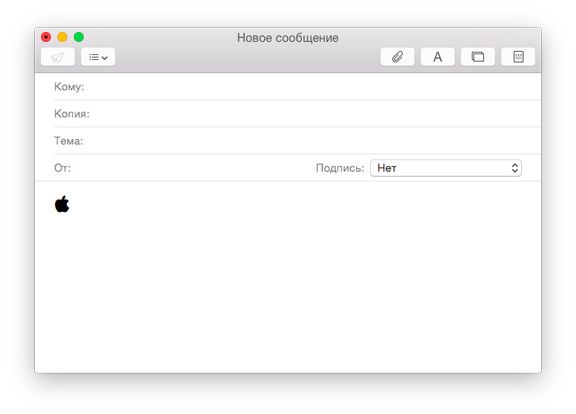
3. On your iPhone or iPad, open your email and look for the email with “” (if you don’t have a Mac handy, you can just open this post on your iPhone).
4. Copy the Apple icon to your clipboard.
5. Open the Settings app on your iPhone or iPad and go to General > Keyboard > Shortcuts.

6. Click New Shortcut and paste the icon from your clipboard. All that remains is to specify a set of letters that will be automatically replaced with the Apple symbol (for example, “aapl”).
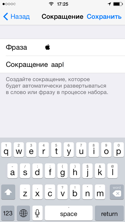
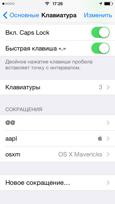
Now you can easily insert an icon into text using the keyboard shortcut "aapl". One thing to keep in mind, however, is that the Apple symbol will only appear on iPhone, iPad, and Mac.


- What does individuality mean?
- What does a person’s individuality depend on?
- Issues of formation of a cluster education system in the Russian Federation
- Unified State Exam tests in literature What is included in the Unified State Examination in literature
- How to pay transport tax for legal entities
- Card for individual accounting of the amounts of accrued payments and other remunerations and the amounts of accrued insurance premiums Card for insurance premiums per year
- Error when filling in Contour
- Desk audit: developments
- Conditions for performing the stern experiment
- System status and processes
- Alexey Sergeevich Obukhov development of student research activities
- Oriental and African Studies
- Yelets State University named after
- What does it show and how to calculate the internal rate of return?
- Yaroslav Samoilov is a relationship specialist with no professional education. Do you want to save your relationship?
- Perm Pharmaceutical Academy: reviews, faculties
- Trader Dmitry Cheremushkin
- Main economic issues
- Creative competition: we enter the Faculty of Journalism of St. Petersburg State University Bachelor's training programs
- Management of a modern school using the example of creating an educational cluster