What does Apple's bitten apple mean? The history of the origin of the Apple logo
Everyone knows the Apple logo in the shape of an apple. The choice of apple is obvious - “Apple” in translation from English means “apple”. But few people know why this apple is bitten. Who bit him? For what purpose? Does this make any sense?
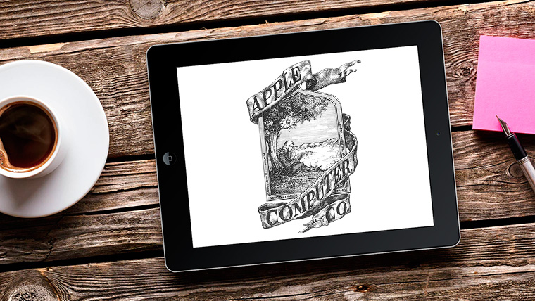
First of all, let's figure out why “Apple” was used for the company name, and therefore for the logo. As writes, this was played out in the very first Apple logo, which was created in 1976. Then one of the co-founders of the company - his name was Ronald Wayne - made a drawing, which became the first logo.
Apple's first logo
The logo Wayne created has nothing in common with the current one. It was a miniature depicting Isaac Newton, an English scientist, on whose head an apple fell while he was relaxing in the garden, after which an epiphany came to him. This idea was the basis for choosing the name and logo of the company.
The logo, although educational, had little to do with the requirements that are usually placed on logos. He was unrecognizable, ill suited printed works, for application to the company's products. Therefore, Wayne's logo lasted about a year, after which Steve Jobs turned to for help graphic designer Rob Yanov with a request to create a modern, recognizable logo.
Second Apple logo
As Yanov later said, the idea for the logo appeared unexpectedly. Rob bought apples, put them in a bowl and began to draw, discarding unnecessary details. The result was an apple similar to a tomato or cherry. All that remained was to make one more stroke so that the apple would be clearly recognized as an apple.
This is how the “bite” appeared. The idea came from a play on the words byte/bite: on the one hand, a technology company that works with information (bytes), on the other, an apple that can be bitten, while a tomato can only be cut.
However, the second logo was different from the current one: it was made in multicolor. This has given rise to many versions, the most common of which is that Apple supports sexual minorities.
But it is not so. Apple does support the LGBT community, but the colorful logo was created a year before a similar rainbow symbol was introduced as a symbol for sexual minorities. At the time of the birth of the Apple logo, this sign was not recognizable, so it has nothing to do with LGBT people.
Then why was the apple multi-colored?
The idea was very simple. At that time, color monitors had just entered the market, and Apple's color logo was intended to reflect the fact that the company produces computers with color monitors. The Mac computer display at that time could display six different colors, which were indicated on the logo. All the primary colors were placed randomly, but the green on top was Jobs's wish that an apple could have a leaf on top, which is always green. The logo existed in this form for 22 years.
Apple's third logo
The third logo has no color scheme. And designer Jonathan Ive came up with the idea to do this.
This happened in 1998. At the time, Apple was experiencing enormous financial difficulties. But Steve Jobs figured out how to save the situation. He relied on elegance and simplicity. This was the order for the new logo: to make elegance and simplicity recognizable.
Secret meanings that do not exist. Some people associate a bitten apple with original sin. According to another version, the logo was created in memory of the founder of computer science, Alan Turing, who died with a bitten apple in his hand. Despite this, the designer who developed the logo has a rational explanation for this choice.
Specialist Rob Yanov, who created the color Apple logo, told Logo Design Love why the company's 1977 logo looked the way it did.
1977 Apple logo creator Rob Janow
Logo Design Love: Is the Apple logo the best thing you've ever designed?
Rob Yanov: Yes, nothing compares to this work.
Have you ever asked Jobs why he named the company Apple?
Honestly, no. I know that for a while Steve ate only fruit. He then lived on a ranch or farm in Northern California and maintained an apple orchard (he considered apples the ideal food). He had a list of ideas for what to name the company, and he had to choose one in order to sign all the documents the next day. The name Apple was at the top of the list, and the company's creators could not come up with anything better. Jobs and Wozniak chose this name despite the threat of a lawsuit from Apple Records.

Why is the apple bitten?
Like many stories, the “legend” of the bite has been retold and changed many times. I created a silhouette of an apple, but it needed to be distinguished from other round fruits. Then I did what everyone does with an apple - I “bite” it. It's funny that 10 years after creating the logo, I started seeing stories about why the apple wasn't whole. Admittedly, many of these stories are more interesting than my logical explanation. The fact that people believe in mysterious stories, tells me that the Apple brand means more to them than just their love for the company's devices.
How did Jobs react to the presentation of the logo?
He just smiled, nodded and didn't say anything. I didn't have to describe my idea for long; we both liked it.
You said that the logo consisted of colored stripes to represent the full color of Apple monitors. How did the audience receive it?
The colorful stripes did illustrate the main difference between Apple and its competitors, but they served another function. My biggest challenge was to design a logo that would show that the computer was friendly enough to be brought home and used by the family. While (in 1977 - editor's note) computers evoked rather negative associations. I wanted to create a positive connection with Apple devices.
 Apple II computer released in 1977
How do you think the logo contributed to the company's success?
The company's success lay in the fact that Steve Jobs knew well what people needed from technology even before they knew about it. He developed very high quality standards and product designs were also great importance. Therefore, I feel that the logo did not play a big role in the company's success. People love the Apple brand name because they like the technology of this manufacturer. If they didn’t like the brand name, they wouldn’t put it on the rear window of the car.
The origin of logos and names of famous companies is sometimes very simple, and sometimes quite mysterious. Any person who is close to the automotive theme knows that the French co-owner proposed to name the Mercedes company in honor of his daughter. Some concerns don’t bother with any clever ideas and put a word on the logo that completely repeats the name - take Coca-Cola, for example.
And there are icons used for the logo, which at first glance have nothing to do with the product or the founder. For example, Apple: how is the fruit related to mobile phones or computer programs? And I was not noticed to have a particular passion for apples.
A little history about the name and logo
The company was originally named "Apple Computer" - the concern in the early years was engaged only in the production of home hardware and programs for it. It was Steve Jobs who proposed this combination of words, and later he again insisted on a joint decision with his namesake and co-owner to leave only “Apple”.

The logo was first a tree, from which, according to famous myth, the fruit fell on Newton's head, then it was replaced by a multi-colored apple, then the coloring was changed, leaving only a gray background. Now the silver apple proudly flaunts on desktop computers, phones and tablets all over the world.
Apple's success is a constant phenomenon
The company still, despite the ups and downs over its long history of existence, firmly holds first place in market capitalization (prices of all shares) - a staggering figure that has exceeded $530 billion.

Troubles in the life of Apple owners, 1981 for Steve Wozniak almost became the last in his life due to an accident, or recent events when a huge number of products did not survive the warranty period - nothing could undermine the triumphant path of the concern to victory over competitors. Apple, like a ruthless shark, has swallowed up many serious companies, shining example that was in 2014, when Beats Electronics was almost forcibly merged into the company for a ridiculous $3 billion.

Even the death of Steve Jobs, which caused panic in the global electronics market, could not cause strong blow by concern. Neither Microsoft nor Google, Apple's most implacable enemies, although they are nipping at Apple's heels, can overtake the company in popularity and number of products sold.
Several versions of the origin of the logo
During his lifetime, Steve Jobs was, on the one hand, a rather boring person (no high-profile scandals and skeletons in the closet), on the other hand, the tabloids, greedy for scandals, constantly tried to debunk this “dullness” and get to the bottom of something in order to dispel perfect image founding father of Apple. The origin of the name and logo is still especially tormenting the minds of those hungry for sensation.

Jobs himself added fuel to the slowly smoldering fire of secrecy. One of his official answers to the question about the origin of the logo is that he chose this fruit as a tribute to Jeff Raskin, the head of Macintosh, whom he replaced in the 80s of the last century (Jeff himself named the concern after his favorite apple variety).
Another version, voiced by Jobs, is very banal, although it coincided with the first picture of the Apple logo: an apple landing on his head and prompting him to discover the famous law.
There were other assumptions by those wishing to decipher the mysterious apple icon, funny or funny. For example, an anonymous source leaked information to the media that Jobs loves cheap Apple juice in a paper bag with a large picture of the fruit on the label, but is embarrassed to admit it.

There were rumors that Steve had permanent vitamin deficiency, and his doctors prescribed him to eat at least one apple a day, and that he constantly carried them in his pocket, periodically taking them out, biting off a piece and putting them back.
Any of the versions looked plausible, but far-fetched. The owner of Apple actually told both his loved ones and the media why he chose the apple, but he really didn’t like it when attention was focused on this option, even the question of the origin of the logo was regularly removed at press conferences.
Why a bitten apple?
The genius of computer technology, Steve Jobs, never hid the fact that his choice of activity was most influenced by the talent of an English mathematician who died under tragic and mysterious circumstances.
According to Jobs, his idol was undeservedly convicted and actually killed, and even a posthumous recognition of his innocence does not atone for the guilt of the British before world science. It is Turing who most likely owes Apple the fact that the apple is now recognizable throughout the world.

It is difficult to describe in a nutshell what a huge contribution this man made to the field of mathematics, logic and cryptography. The "Turing machine" is an abstract computing device, officially recognized as the predecessor of the desktop computer.
While working in the secret branch of British Intelligence during World War II, Turing studied and broke German codes. What was the cost of the blow to the German Enigma encryption system - it was developed in Germany in 1918, was first used in banks, and during the war it began to be used to encrypt messages of the naval fleet. Before Turing, Enigma was considered ideal in terms of security - it was believed that it was impossible to break it. Even when the Germans realized that Enigma had been broken and improved the codes, Turing made them easy to read again within a couple of months.

Although the scientist was deeply apolitical, despite working in intelligence, he was not spared Cold War after the end of the First World War. It was rumored that the bastions of Soviet ciphers, which Turing had begun to work on declassifying, were about to fall. Successful at work, Alan was very secretive and modest in everyday life; nothing was known about his personal life until a stupid incident in 1952 when his house was robbed.
It turned out that Alan's house was broken into... by a friend of his lover. It turns out that the talented mathematician is a homosexual, a disgrace for highly moral, prim England! Nowadays it is not surprising when the Queen awards the title of Lord to people of non-standard sexual orientation(example, singer), and in those years the laws great empire were merciless: arrest, complete deprivation of titles and rights.
Turing was taken into custody and charged with obscenity (this is the name given to homosexuality in the English procedural code). The accused himself had to choose the punishment - long-term prison or freedom, but with the condition of forced castration. Turing chose the latter.

Unemployed, completely cut off from science, broken physically and morally, Alan, who was not very sociable before, renounced outside world and lived alone, communicating only with his mother. Just two years after his release from custody, he was found dead, and next to him lay on the floor a bitten apple, laced with a lethal dose of cyanide.
The official version is suicide, but why such a clever way to commit suicide? The mother of the deceased tried to get the case reviewed, claiming that her son shared with her shortly before his death interesting information: allegedly the “long hand of Moscow” offered him to move to the USSR and work there. Alan, according to his mother, refused immediately, and his death is the “Reds’” revenge for intractability.

In 2009, Alan Turing was exonerated by the British government, and Prime Minister Gordon Brown even made a public posthumous apology to him. Steve Jobs told friends and family many times that premature death this genius dealt an irreparable blow to science, and that the apple with cyanide set back the development of computer technology for a long time. Jobs was never known to be gay, but he was liberal towards people like Turing.
Here is a fact that also speaks in favor of the fact that it was the apple that brought death to the English homosexual mathematician that was taken as the prototype for the Apple logo: at first it was multi-colored. It’s beautiful, but there’s only one embarrassing nuance – the combination of these particular rainbow colors is still the emblem of homosexuals.
At the insistence of his colleagues (“We are losing the market among opponents of homosexuality!”), Steve Jobs first agreed to the black version. From 1998 to 2001, the famous apple was charcoal in color, but looked a bit gloomy, and it was decided to repaint it in a silver shade.
On April 1, 1976, Steve Jobs founded Apple. Today, 41 years later, it is difficult to find a person who has not heard of her. The company that gave the world the mouse, trackpad and graphical user interface has not yet fully revealed the secret of the origin of its logo - a bitten apple.
Helped make the brand what it is today. The modern user knows what the company's logo looks like, and some even remember the rainbow-colored apple decorating the gray Macintosh. But when it comes to why Apple has a bitten apple as their logo, many are forced to admit that they do not know the correct answer to this question.
What does the apple have to do with it?
It seems that even now no one fully understands why the company was named Apple. Hardly anyone associates computers with apples. The history of the appearance of such unusual symbol brand is overgrown with myths and legends. Because Steve Jobs was working on an apple farm in the summer of 1975? Or was it all about his love for the Beatles (their recording studio was called Apple Records)? Or he just liked McIntosh apples.
Where did the history of the logo begin?
Few people know, but in 1976 Apple had a different logo. It showed Newton resting under an apple tree. Such a brand name did not look stylish at all and was not suitable for use in small sizes. If you look at the instructions for the Apple I (the company’s very first computer), you can see exactly this complex logo.

So why does Apple have a bitten apple as their logo? The answer to the question goes back to 1976, when the brand was first born. Anyone who is even slightly interested in modern technology knows that Apple was founded by Steve Jobs and Steve Wozniak. In fact, the company had three, and not two, as is commonly believed, founders - Steve Jobs, Steve Wozniak and the lesser known Ron Wayne. The latter gave up his stake in the company less than two weeks after its creation. Now Ron admits that even then he saw a successful future for the young company, but does not regret his choice. And if he had the opportunity to change his mind, he would have done the same.

The reason for refusing a 10% stake in a promising company lies in Ron's negative past experiences and his reluctance to take risks. At the very beginning of Apple's journey, it received an order for 50 computers. In order to collect them, it was necessary to take out a loan of $15,000. Wayne had heard that the customer company had a history of difficulty paying suppliers. Being no longer young (43 years old), Ron did not want to take risks by getting involved in transactions with the possibility of losing all his property. Unlike both Steves, he had own house and a car.
It was Ron Wayne who, at the beginning of the founding of the company, drew the first logo - an image of the brilliant Isaac Newton reading a book under an apple tree.

The appearance of the famous logo
The logo appeared shortly before the release of the Apple II. The history of its origin began in April 1977. Steve Jobs turned to Rob Yanov, a middle-aged designer at Regis McKenna Advertising. Back then, many people predicted failure for the company if they kept the same logo. He was too intellectual and not suitable for depicting him in small sizes. According to the author of the book "Little Kingdom": private story Apple Computer" by Michael Morritz, Steve Jobs actually believed that the logo could be one of the reasons for the poor sales of the Apple I. Curious, Rob spent several days looking at different angles apples purchased from a nearby store. As a result, the designer came to the conclusion that simplicity is the key to success, and drew a logo in the form of a monochrome bitten apple.
rainbow apple

Jobs liked the idea, but insisted that the logo be in color, despite the best efforts of an advertising executive to dissuade him due to the high printing costs. By the way, all the attacks of the company’s ill-wishers, who claim that Yanov borrowed the idea of a colored logo from the well-known rainbow flag, have no basis - the symbol of sexual minorities began to be used by the community only in 1979. However, there is an opinion that the similarity of the flags was the reason for changing the color of the logo in 1998. The bitten apple became what it was originally intended to be - monochrome.
“There was also a practical reason for the multi-colored stripes in the first logo: the Apple II was the first personal computer that could display color images on a monitor,” Yanov explained.
The most expensive logo
Steve Jobs was responsible for most work when creating a logo. The challenge was to print it in multiple colors next to each other. The four multi-stage color printing technologies known at the time left the risk that layers could be misaligned and overlap each other. Yanov suggested dividing the layers with thin black lines. This would solve the problem and make printing cheaper. However, Steve Jobs firmly decided that the logo should be without stripes. For this reason, Apple's Michael M. Scott called it "the most damn expensive logo ever created."
It is noteworthy that Rob Yanov did not receive a penny for his legendary work. “They didn’t even send postcards,” he said in an interview. Steve Jobs managed to establish great relationship with the chief marketer of Silicon Valley, and he allowed the growing company to use the services of his subordinates for free.
Bitten Apple
According to Lensmeyer, Rob Janow started with a silhouette of a black apple on a white background, but felt something was missing. A play on words Apple had previously used in advertising for the Apple I, Yanov was told to bite the apple (“bite” in English translated as “bite” and pronounced like a computer “byte”).
“The bitten apple means that the logo also no longer resembles a tomato, cherry or any other fruit,” Yanov said.
Bill Kelly, also of Regis McKenna Advertising, remembers a different story. He says that a bitten apple is a symbol of temptation and the acquisition of knowledge (a reference to the biblical tree of knowledge). A hint of how modern technologies helping humanity learn and develop faster, but at the same time making it more and more dependent on them.
inspired by Apple?
In 1954, computer scientist and brilliant mathematician Alan Turing died after biting into a cyanide-laced apple. For a long time it was assumed that it was suicide, possibly due to the chemical castration that the British government imposed on him after confessing to sexual relations with a man. Although it is now assumed that Turing's suicide was not deliberate. He was often careless with his experiments and could easily have accidentally inhaled cyanide or placed an apple in a puddle of cyanide.

Whatever happened, the bitten apple was found at Turing's bedside. Two decades later, two guys began making computers in their garage. They knew about Turing's contributions to programming and computer science and decided to honor him. And the world received an iconic logo.
According to the designer who created the logo, Rob Yanov, this beautiful story does not apply to reality. "It's just wonderful urban legend" he said in 2009. Other theories - a reference to the first woman, Eve biting the forbidden fruit, or Newton's discovery of gravity - are also wrong.
However, when actor Stephen Fry once asked his good friend Steve Jobs about whether he had famous logo attitude towards the Turing apple, Jobs responded: "God, we wish it were like that."
What does Apple's bitten apple mean?
The true reason for the birth of such an unusual brand name remains a mystery even to Apple employees. On the other hand, such an abundance of legends around this adds a special mystery to the history of the logo, allowing each user to interpret it in their own way.

According to the employee Apple Jean-Louis Gasier, this is where his brilliance lies: “Our logo reflects both passion and disorder, reason and hope. We couldn't have asked for anything better." Today no one dares to deny that a memorable and simple at first glance icon played a crucial role in the development of the brand.
Few people know, but the photo above is the real Apple logo.
Apple's main symbol has been updated several times already. Changing the logo is a kind of control point, marking a transition to new views and principles of the company. Moreover, these changes were never random.
Are you sure you remember the old company logos? Let's figure it out.
Newton logo (1976 - 1977)
The first Apple logo is far from the modern, laconic symbol. By and large, he stood out in those days. The logo was created by one of the founders of Apple, Ronald Wayne, who quickly sold his stake in the company. It's a cool idea - to use the widely circulated story about the discovery of gravity by Isaac Newton. But its implementation leaves much to be desired.
Minimalism? No, we haven't heard. The logo looks more like a coat of arms: a shield, a heraldic ribbon, a pompous signature. Absolutely not suitable for application to products, and all because of its bulky geometry and abundance small parts. Fortunately, it didn't last long.
Rainbow Logo (1977 - 1998)

An ambitious company needs a recognizable symbol. That is why Apple founders turned to designer Rob Janoff from Regis McKenna. It was he who created the well-known bitten apple in rainbow colors.
In an interview, the designer said that he simply bought a bag of apples and experimented with them for a week. Many hoax fans like to attribute hidden meanings this logo. But Rob Janoff debunked all the myths, according to him, he did not make any references to Alan Turing or the Garden of Eden:
- stripes of all the colors of the rainbow speak of competitive advantage Apple computers that could display color images;
- the incorrect order of these colors is justified by the fact that an apple leaf should be green;
- the fruit was “bitten” so as not to confuse the apple with other fruits;
- the consonant “byte” and “bite” remain only curious coincidences.
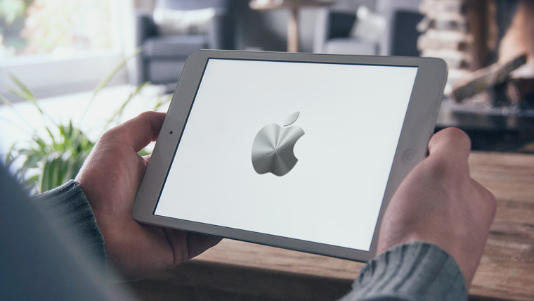
Monochrome logo (1998–present)

By the end of the nineties, Apple was on the verge of failure. After his return to the company, Steve Jobs made a splash - he closed unpromising projects, updated the staff and stopped renewing licenses for branded products. software. In order to forever disown the disastrous old course, the logo was also changed. From 1998 until now it has been a solid apple.
If the size of the previous logo rarely exceeded 1.5 x 1.5 cm, then the monochrome version is usually larger, brighter and more noticeable. Now the “apple” is drawn in three colors: black, white and grey. But before there were more varieties, here are the most famous:
iMac G3 logo
The release of the iMac G3 in 1998 marked the return of Apple. Stylish all-in-one PCs had just such a logo, and it was the same color as part of the case. The PowerMac, Apple Studio Display and iBook, released a year later, received similar logos.
“Aqua” logo

This logo first appeared on the PowerMac G4 Cube and was used for several years in advertising and banners. Plus, it could be seen in early versions of OS X, because the logo fit perfectly into the concept of the Aqua interface.
"Glass" logo

Users of Apple's desktop OS first saw this logo in 2002 when upgrading to OS X Panther. With the release of the iPhone in 2007, this symbol moved to mobile devices. It was replaced only in 2013 in connection with the release of iOS 7 and the abandonment of skeuomorphism.
Metal logo
Metal logos are one of Apple's favorite and recognizable features. Having appeared in the iMac G4 all-in-one PCs, such logos roamed across all categories of Apple products. iPhone cases with holes? All for the sake of the treasured metal apple.
Logo “Product.RED”
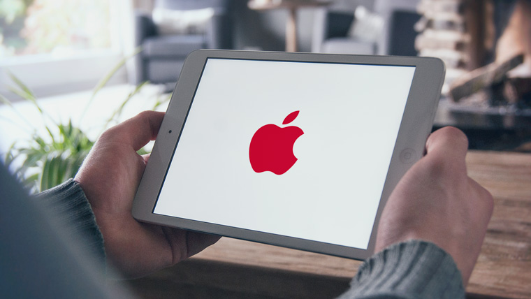
Apple is partnering with Product Red to help the latter raise funds for the Global Fund to Fight AIDS, Tuberculosis and Malaria. On the official website of the Cupertino company you can find products, part of the proceeds from which go to this fund. Once a year, on the first of December, on World AIDS Day, Apple turns its logo red.
What's next?
Of course, Apple won't change the shape of its logo. Expect exotic company color solutions It’s also not worth it, minimalism is in fashion now. Perhaps soon we will see the familiar logo made from new materials. Maybe


")


- Abstract: Elementary particles
- Presentation on the topic "management"
- History of the development of computer technology presentation for a lesson on the topic Historical development of computer technology presentation
- Astronomy Presentations Interesting Topics for Astronomy Presentations
- Presentation on history "counting years in history"
- Astronomy Presentations Astronomy Presentation Template
- The anniversary of the expulsion of the Karachais recalled the problem of rehabilitation of repressed peoples
- Udmurt people What peoples live on the territory of Udmurtia
- Russia is a multinational state We live in a multinational country
- The smallest peoples of the world Which group of peoples is the smallest
- How to change a cash receipt order in 1c
- Day of Remembrance of Fallen Russian Internal Affairs Officers Heroism of Police Officers
- Northern coast of Neva Bay
- Enviable beauties in politics (17 photos)
- The best ballet performances
- Biography, political activity
- The magical world of crystals
- How to salt milk mushrooms: a quick recipe
- Ten Surprisingly Profitable Illegal Trades
- Management project based on the example of an enterprise presentation